Natality
Introduction
Problem:
A government medical agency wanted to gain a better understanding of mother demographic factors that contribute to abnormal birth weight and gestation of newborns.
Context:
I carried out this analysis as a student for a project in CareerFoundry's Data Analytics Program, and I also chose the subject and data set for this project. The purpose of this project was to become more familiar with advanced Python skills commonly used by data analysts.
Goal:
My insights were intended help the agency provide medical providers additional guidelines on optimizing a woman's chance of delivering a healthy newborn at full term.

Tools:
- Python
- Jupyter
- Tableau
Data:
US CDC Natality Data Set 2019-2021 (variables listed below)
- State
- Date (month & year)
- Mother's Education Level
- Month Prenatal Care Began
- Number of Births
- Average Birth Weight
- Average Mother Age
- Average Gestational Age (LMP)
To view the data set, click here.
Process
Process Steps:
| Step | Skills | Purpose |
|---|---|---|
| 1. Data sourcing, profiling, & cleaning | Sourced or found data set for the analysis; addressed missing values, duplicate records, records with null values, and mixed data types; changed data types; removed records with too many missing values; data profiling & consistency checks. | Found and prepared data for analysis and reduced potential for error. |
| 2. Deriving new columns | Created new columns in data set based that were based on values in other columns. | Created important categories for future analysis and visualizations such as date, season, region, birth weight categories, gestation categories, and mother's age category. |
| 3. Exploring data | Created a variety of charts such as scatterplots, bar charts, heatmaps, and pairwise comparisons to explore factors affecting birth weight and gestation. | Provided guidance on where to conduct more in-depth analysis. |
| 4. Forming a hypothesis | After data exploration, formed a statement based on initial evidence that can be proven or disproven. | Gave direction to the analysis. |
| 5. Creating geographical visualizations | Worked with JSON file; checked for extreme values; created dataframes of weighted averages by state; plotted choropleth maps of mother age, birth weight, and gestation. | Enabled viewing of regional differences and relationships between mother age, birth weight, and gestation. |
| 6. Conducting linear regression analysis (supervised machine learning) | Reshaped x and y variables into NumPy arrays, split data into training and test sets, ran the linear regression, interpreted of how regression line fits data, checked performance statistics, compared predicted vs actual y values | Determined if linear regression was appropriate model to make predictions regarding this data set. |
| 7. Running a k-means clustering algorithm (unsupervised machine learning) | Standardized the data set, used elbow technique to determine number of clusters, run k-means, created visualizations. | Found patterns in data and associations/groupings that would not otherwise have been found. |
| 8. Conducting time series analysis | Subsetting data to view variable of interest and time, plot basic line graph, decomposed data components, conducted Dickey-Fuller test for stationarity, viewed autocorrelation, differencing on non-stationary data sets | Understand preparation for running a time series analysis. |
Data Exploration:
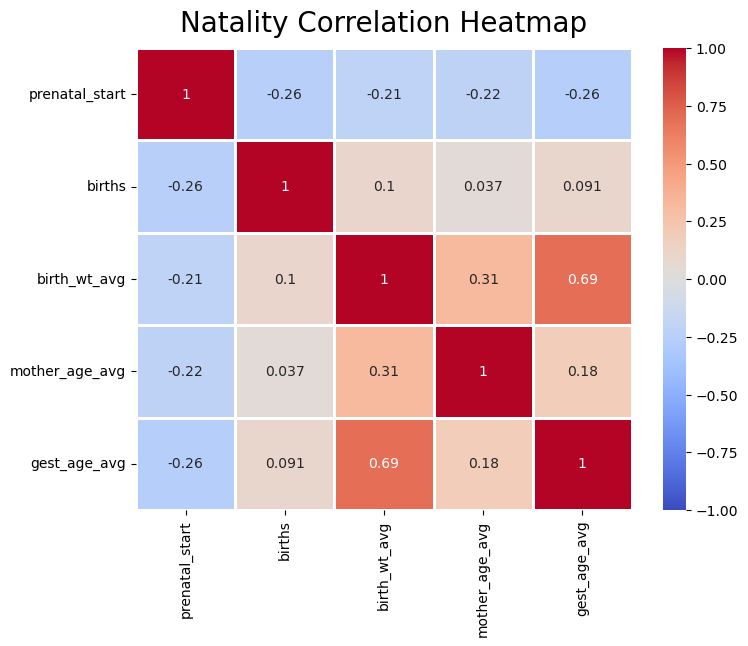
There were many charts created when exploring the data in process step 3. This heatmap is valuable because it shows the strength of the correlation between all variable pairs. Besides the relationship between gestation and birth weight being the strongest, which is what was expected, mother age and birth weight was the next strongest relationship. The closer the number in each square is to 1.00 or -1.00, the stronger the relationship. A number of 0.00, or close to it, would represent no relationship.
Expectations of Exploration:
My expectation was that education and prenatal care start month would play a greater role in affecting birth weight and gestation times, but to my surprise mother age played a greater role in these two variables.
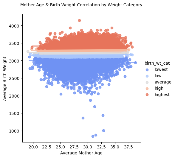
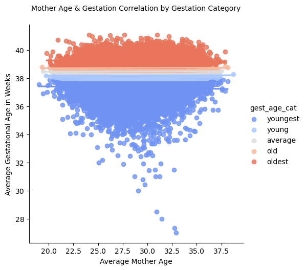
These visuals demonstrate a closer look at the correlation between mother age and birth weight and gestation.
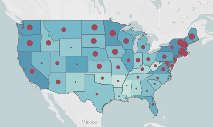
Geographical Visualizations:
The map below has shades of teal that represent mother age; the darker the shade of teal, the older the average mother age of that state. The size of the red dots represent the weighted birth weight averages of the state; the larger the dot, the heavier the average birth weight.
Challenges:
Everything from values and variables to dataframes and more in Python have something called an object type. In order for the map to accept the weighted averages calculated in process step 5 and display them geographically, the resulting data set needed to be a dataframe and not a groupby object. To get around this, I had to export the weighted average results, manipulate them in Excel, then import these results back into Python as a dataframe. There was no other shortcut of transforming the weighted average results from an object to a dataframe.
Forming Hypotheses:
Once I conducted initial exploratory data analysis and found notable patterns, it was time to dig deeper. I formed the following hypotheses after EDA in previous steps. These statements guided the remainder of my analysis.
If a woman who is older than 35 gives birth, then she is more likely to give birth to a newborn of above average birth weight. If a woman is younger, such as in her 20s or up to her early 30s, then she is more likely to give birth to a newborn of below average birth weight.
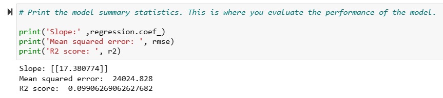
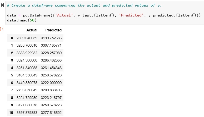
Linear Regression (Supervised Machine Learning):
I conducted a linear regression analysis using a linear regression model from the Scikit-Learn library. Linear regression is a relationship between two variables that can be described and predicted by an equation that produces a relatively straight upward or downward sloping line. This means as one variable increases in value, the other value increases or decreases within a predictable range of values. Finally, I evaluted the fit of the data to the model to see if a linear regression model could accurately predict a newborn's birth weight based on a mother's age. The results indicated that although there was a weak linear relationship between mother's age and birth weight, the relationship could not be used to make predictions using linear regression analysis. The r2 score on the top indicates how well the linear regression model is able to predict values in the data. The closer to the r2 value is to 1.00, the better the model is at making predictions about the data set. This value is different than the Pearson's correlation coefficient of 0.31 found in the heatmap above (or by taking the square root of r2). While the Pearson's correlation coefficient of 0.31 indicates a weak to moderate linear relationship, the small r2 value of 0.09 indicates that linear regression cannot be used to accurately make predictions in this data set.
K-Means Cluster Analysis (Unsupervised Machine Learning):
Linear Regression was not sufficient to prove my hypothesis or implement a satisfactory prediction model. As a result, I conducted a cluster analysis
to identify insights I might not have otherwise known to look for.
I discovered three primary clusters. I can compare data in these clusters to reveal new patterns. The three clusters are represented by three colors: green, orange, and blue.
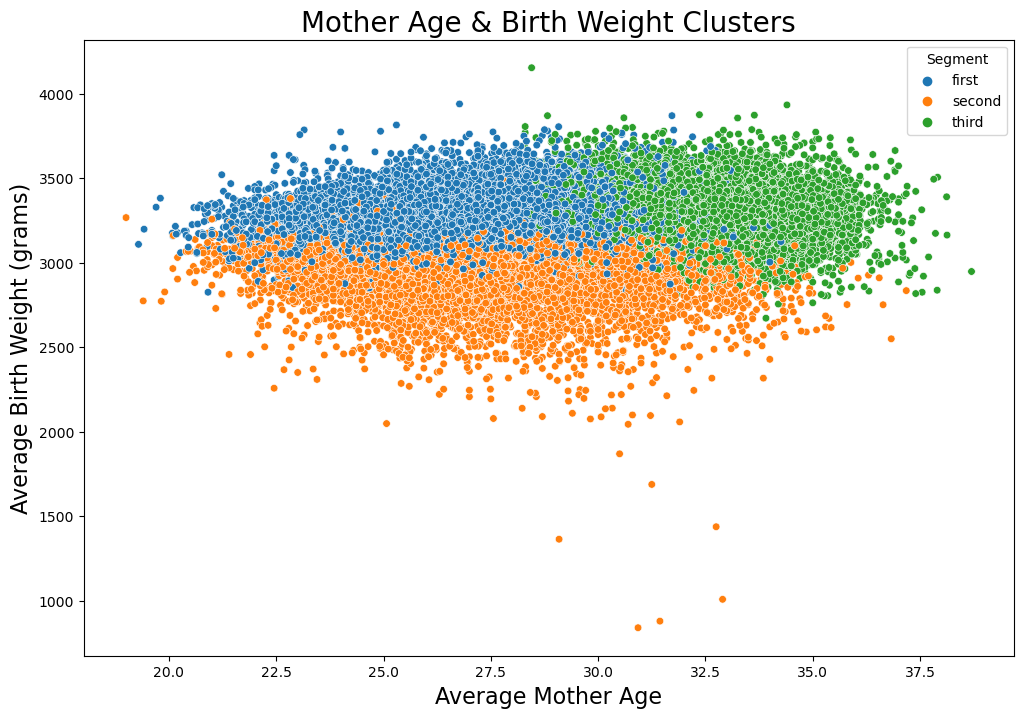
Results:
Results indicated there were three main groups of women who gave birth.- Green - Women who gave birth to infants of above average birth weights, had somewhat longer gestation times, were over 30 years of age, and had a master's degree on average.
- Orange - Women who gave birth to infants of lower than average birth weights, had average gestation times, were in their 20s, and had a high school education.
- Blue - Women who gave birth to infants of average birth weight and gestation times, were in their 20s, and had a high school education.
Recommendations
Next steps:
- Combine additional medical and lifestyle data with current data to better understand the complexity of the relationship between mother age and birth weight.
- Allocate additional medical resources and education to regions that have a disproportionate amount of women giving birth in age brackets more at risk for unusually low or high birth weights.
- Run a classification algorithm to help predict the risk group to which women belong, such as random tree, random forest, and K-nearest neighbor.
- Because data was discovered to be seasonal, run a time series model, such as SARIMAX, on the data to predict seasonal variations in birth rates and birth weights.
Retrospective:
If I were to redo this analysis, more effort would be made to combine health data with the current data to gain a better understanding of what underlying health conditions may lead to abormal birth weights and gestation times, pre-term delivery, miscarriages, etc. The CDC database had an option to obtain health data, but it was limited to just a few conditions. Much of this information could not be added to the current data set at the time of download, so it would likley need to be merged with the current data set. However, much of the medical knowledge gained in this analysis is already known within the medical community, and further analysis would only serve to demonstrate greater analytical skill.
For More:
To view the project files or see the Tableau presentation, click the links below.