Instacart
Introduction
Problem:
Instacart’s sales were doing well, but to continue to grow, the grocer needed to understand the purchasing behavior of different customer segments. Before conducting by analysis, I examined customer goals and objectives.
Context:
I carried out this analysis as a student for a project in CareerFoundry's Data Analytics Program. The purpose of this project was to become familiar with Python skills commonly used by data analysts.
Goal:
My goal was to help the client reach the right customers at the right time with the most effective advertising and marketing strategies.
Customer Objectives:
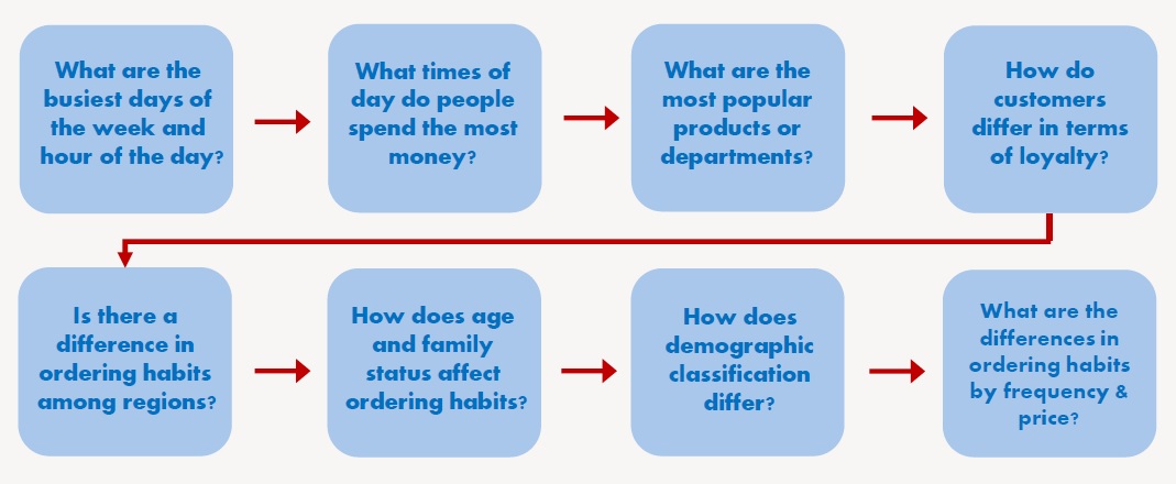
These are customer questions and concerns I took into account before conducting the analysis. These questions were especially important to process steps 5-7 found in the process section below.
Tools:
- Python
- Jupyter
- Excel
Data:
- Orders
- Products
- Customers
- Orders Products Prior
- Departments
To view the data sets, click here.
Process
Process Steps:
| Step | Skills | Purpose |
|---|---|---|
| 1. Importing & exploring data | Viewed data sets, calculated descriptive statistics, and checked data types. | Explored data to better prepare for cleaning and wrangling steps. |
| 2. Data wrangling & subsetting | Transposed data sets, viewed categories of data, changed data types, and changed column names. | Prepared data for analysis, explored data, promoted faster processing speed, and made data categories more intuitive for client. |
| 3. Data cleaning | Addressed missing data, duplicate records, mixed data types, and other errors. | Prepared data for analysis and reduced potential for error. |
| 4. Merging data sets | Joined data sets together. | Made analysis easier and helped find relationships between variables. |
| 5. Deriving new variables | Created new columns in the newly merged data set that were based on values in other columns. | Created important categories for future analysis and visualizations such as customer region, age, family size, and other factors. |
| 6. Grouping & aggregating | Grouped data set by one or more columns and combined with aggregate functions to see basic statistics of grouped data. | Allowed for columns creation based on values of categories of data, expanding possibilities in visualization step. |
| 7. Visualization | Created scatterplots, bar charts, heatmaps, and other charts and graphs. | Fostered communication of results and recommendations with client. |
Process Details:
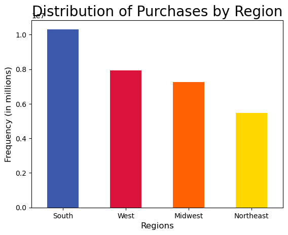
This is an example of creating new variables (process step 5 above). This allowed me to create new columns within the data set to be able to visualize the data by different categories. Here, I began by using Python code to divide the data set records by customer region. I then made visualizations based on customer region. I went through a similar process to categorize the data by other categories, such as customer age, family size, frequency of placed orders, and so on.
Northeast = ['Maine','New Hampshire','Vermont','Massachusetts','Rhode Island','Connecticut','New York','Pennsylvania','New Jersey']
Midwest = ['Wisconsin','Michigan','Illinois','Indiana','Ohio','North Dakota','South Dakota','Nebraska','Kansas','Minnesota','Iowa','Missouri']
South = ['Delaware', 'Maryland', 'District of Columbia', 'Virginia', 'West Virginia', 'North Carolina', 'South Carolina', 'Georgia', 'Florida', 'Kentucky',
'Tennessee', 'Mississippi', 'Alabama', 'Oklahoma', 'Texas', 'Arkansas', 'Louisiana']
West = ['Idaho', 'Montana', 'Wyoming', 'Nevada', 'Utah', 'Colorado', 'Arizona', 'New Mexico', 'Alaska', 'Washington', 'Oregon', 'California', 'Hawaii']

df_all.loc[df_all['state'].isin(Northeast), 'region'] = 'Northeast'
df_all.loc[df_all['state'].isin(Midwest), 'region'] = 'Midwest'
df_all.loc[df_all['state'].isin(South), 'region'] = 'South'
df_all.loc[df_all['state'].isin(West), 'region'] = 'West'
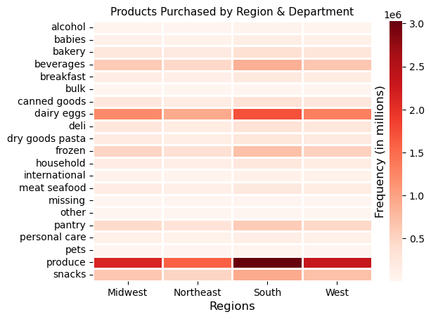
Comparing Two Variables at Once:
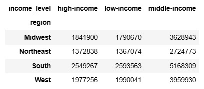
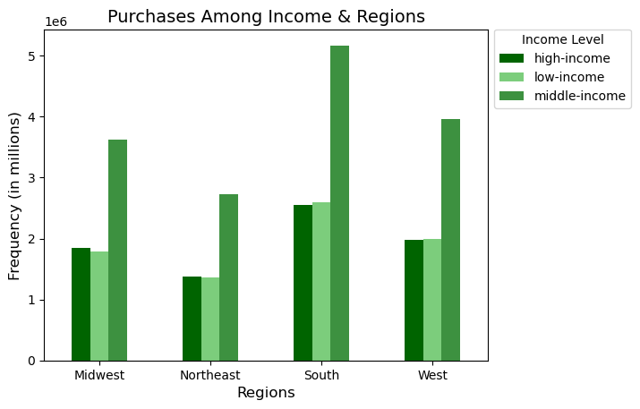
When comparing two flags or categories at once, crosstabs, clustered bar charts, and heatmaps were quite helpful. Referring to the images below, the crosstab function in Pandas (a Python library) was used to count the number of items purchased by looking at two categories, region and customer income, while the clustered bar chart visualized this relationship. The heatmap was also used to show items purchased by region and grocery store department.
Surprising Results:
When I compared two or more variables at once, they seemed to be independent of one another. For example, if I looked at region and department, the popular departments in each region were the same as the population as a whole. All relationship pairs in the data set followed this pattern, whether it was income category and department or any other relationship pair.
Recommendations
Primary Customer Demographics & Product Information:
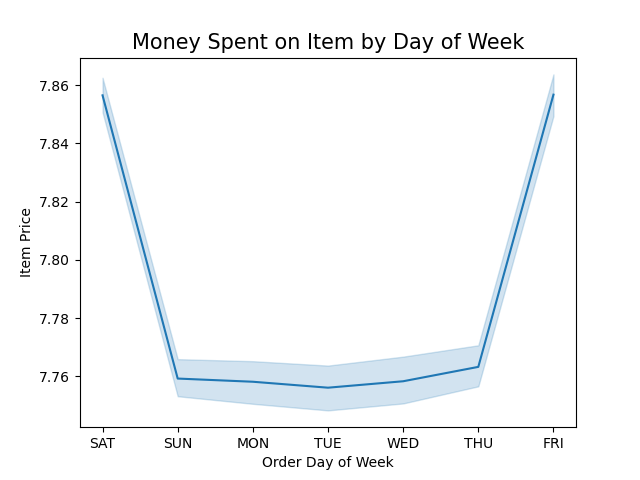
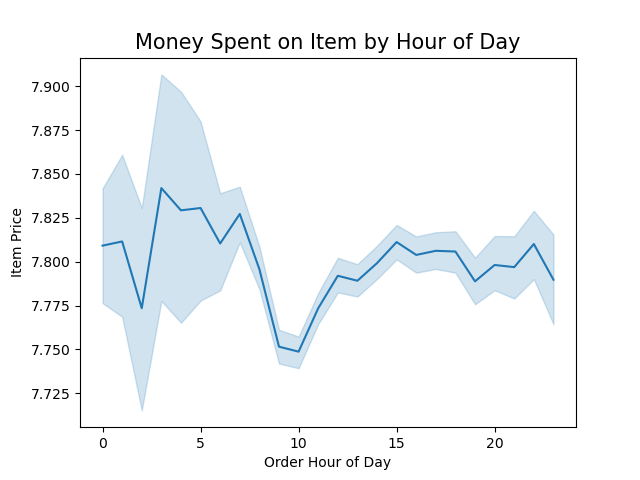
Boost sales by advertising during slower days of the week and times of day, which is Tuesday & Wednesday in the early morning and in the evening starting after 5 p.m. Target the demographics responsible for the most sales during this time. See description below.
- Young & middle-aged customers
- Mid-sized families (1 or 2 children)
- Middle income customers
- South and western customers
- Regular & frequent customers
- Mid- & low-range priced products
- Popular departments: produce, dairy/eggs, snacks, beverages, frozen, pantry
Most Frequent Shoppers:
Frequency is the time duration since a customer's previous order. Here are the insights and recommendations regarding frequency.
- Young adult and medium-sized households are the most frequent shoppers.
- To encourage other customers to shop more frequently, offer coupons, sales, and free gifts with purchase with quickly approaching expiration dates to the following groups: middle-aged and older adults, childless and large households.
High Rollers:
Customers are more likely to spend liberally in the middle of the night and early morning hours on the weekend. Run ads and offer discounts for high-range priced products during the weekend between 3 and 7 a.m.
Retrospective:
If I were to redo this analysis, I might add more complex customer profiles, such as vegetarians, young parents, and so on. My goal at the time, however, was to keep the results simple and easy to understand. In retrospect, I may have consulted the client about their customer segements of interest and conducted additional market analysis of important or emerging customer segments. Finally, I would only display results that were notable and significant and display them separately from the other customer data. Also, I may have analyzed the data by orders or by price per order or number of products per order, then examined this by region, income, or other customer segment. I think this would provide valuable information on the highest spending customers.
For More:
To view Python scripts, more visualizations, or read more insights & recommendations, click the link below.