Crops & Drought
Introduction
Problem:
Many US Midwestern states have been negatively affected by drought in the past few years. My goal in this analysis was to determine what crops have suffered or thrived in these conditions and to uncover new insights that would help future growing seasons.
Context:
I carried out this analysis on my own, before enrolling in CareerFoundry's Data Analytics Program. The purpose of this project was to become familiar with data cleaning, analysis, visualization, and automation tasks commonly used by data analysts. Also, important to note, I can no longer access my Power BI dashboard, only my visualizations and source data, because my business email associated with my account has changed. However, I have made an effort to provide a case study that demonstrates my process and results.
Goal:
My goal for this analysis was to provide needed evidence regarding what crops survived and thrived recent drought conditions. Doing so helped inform farmers what crops to plant during mild to moderate droughts.
Tools:
- Power BI
- Excel
Data:
- US Drought Monitor Data by State (2018-2022)
- County Agriculture Production Survey by State, CAPS (2018-2022)
To view the data sets, click here.
Process
Process Steps:
| Step | Skills | Purpose |
|---|---|---|
| 1. Data sourcing & cleaning | Found appopriate reliable government data for analysis and cleaned data: deleted unncessary data first (critical step with Power BI), only left fall Drought Monitor data to match dates in crop data and reduce processing burden in Power BI, combined state and country FIP numbers to have matching columns in all data sets, kept only two relevent production measures, combined drought levels so there were only 3, significant cleaning and transformation to production measures and units to crop data, deleted unmatched counties between two data sets. | Ensured analysis was reliable, reduced processing time and burden in Power BI, prepared for merging and analysis. |
| 2. Creating a data model, merging, & appending data | Created a data model and merged and appended data where appropriate. | Enabled easier data analysis and visualization. |
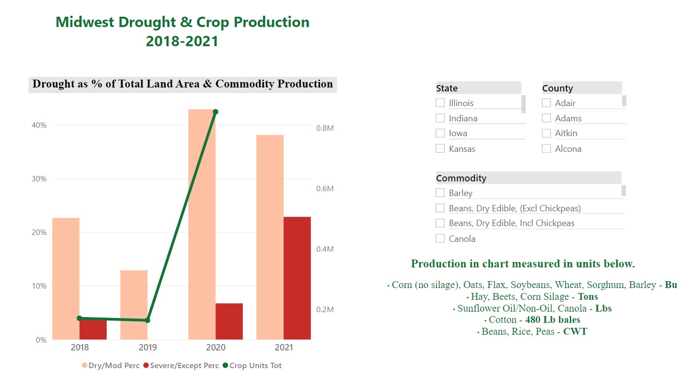
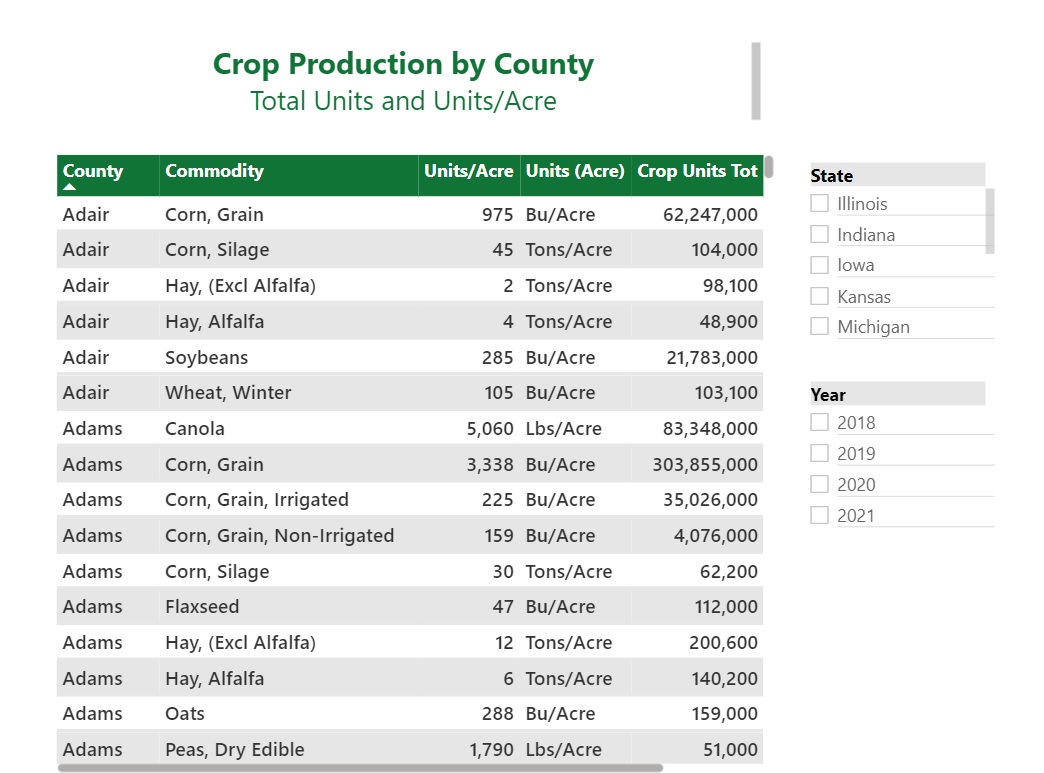
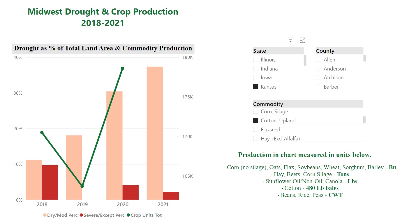
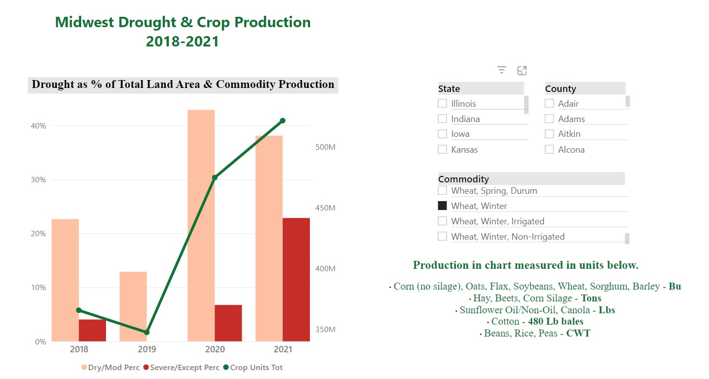
| 3. Data visualization | Created clustered bar chart/line graph to show combined crop production and drought data, interactive table with crop production data for all of Midwest by year and state, treemap chart with percentage of land with extreme drought by state. | Fostered communication of results and recommendations with client. |
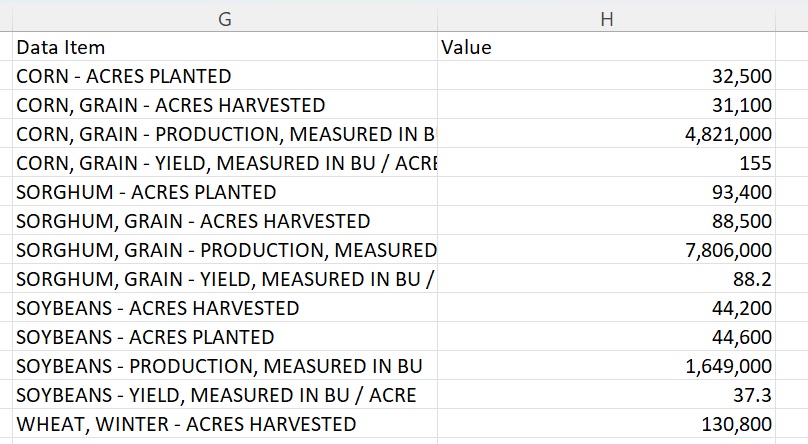
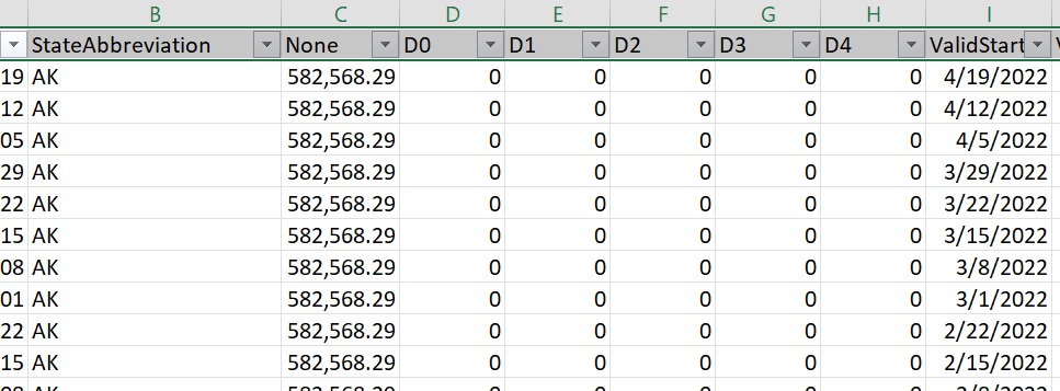
Extensive Data Cleaning & Transformation:
I encountered the need extensive data cleaning and transformation for this project. In the visuals below, the orginal state crop production data sets contained multiple crops, both amounts planted and harvested, and many different units. Here, I only kept units per acre and total crop units, and I had to transform rows into columns and make other adjustments to clean and organize this data. The second photo shows the various drought levels in the Drought Monitor data I categorized into fewer categories and put the total acres of each drought level: which I recall was no drought, dry to moderate, and severe to exceptional drought.
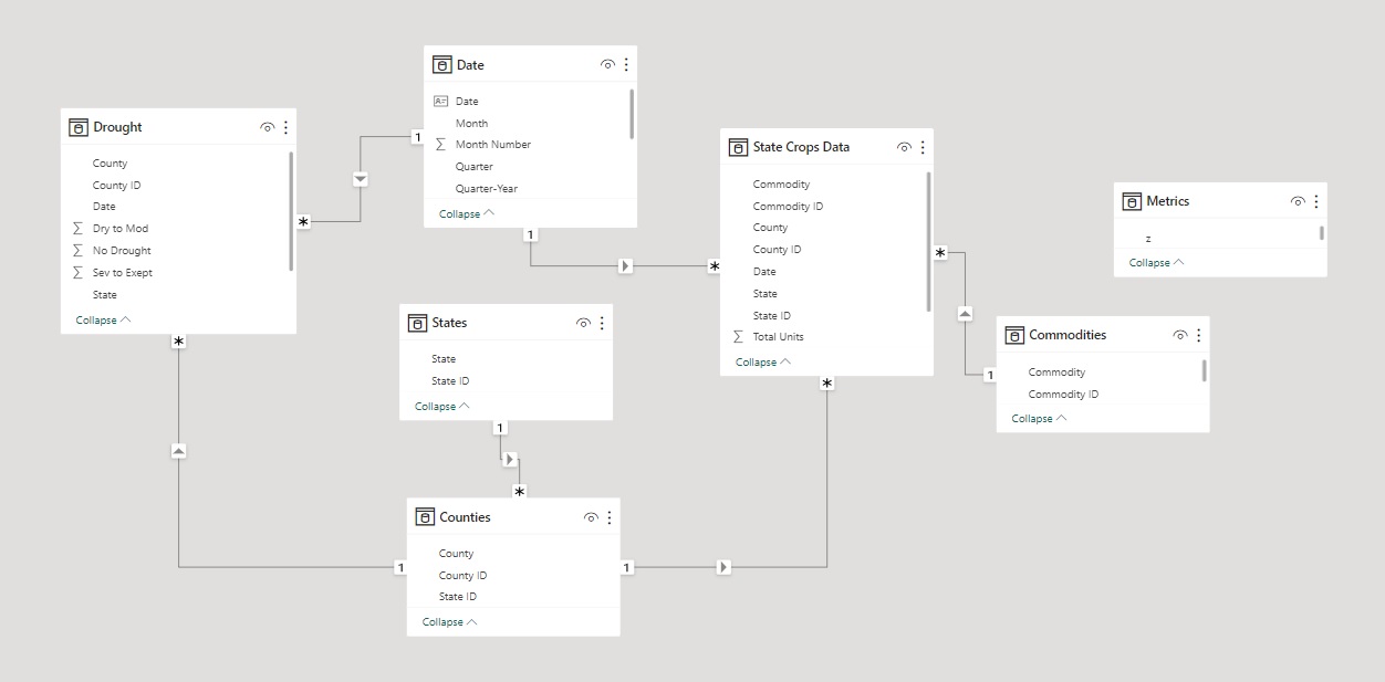
Data Model:
The following is an image of the data model I created in Power BI.
Visualizations:
At the time I created these visualizations, my intention was to allow interested individuals to use the buttons, much like using an app, to easily navigate to information of interest to them: crops, state, county, etc. You can see below how the buttons allow the user to customize their report.
Recommendations
Primary Insights:
- Most crops, especially corn, have seen significant decreases in production throughout dry to moderate conditions as well as severe to exceptional drought conditions. Some crops, however, have only seen production decreases during extreme drought conditions but not dry to moderate. More drastic measures may need to be put in place for successful growing seasons, such as irrigation, planting drought resistant crops, or IoT fertigation (a crop production method used in Japan).
- Cotton has done exceptionally well in dry to moderate drought conditions, as well as winter wheat. If after calculating percent yield the results are still positive, it is recommended that these two crops be planted during seasons that are forecasted to have dry to moderate drought conditions, as long as the other environmental factors are suitable for growing these crops.
- The Midwest states hit hardest by extreme drought conditions have been the western part of the region, especially in North Dakota and South Dakota. More drastic measures may need to be put in place for successful growing seasons, such as irrigation, planting drought resistant crops, or IoT fertigation.
Retrospective:
If I were to redo this analysis, I would be sure to calculate percent yield or weighted average of units per acre for each crop. For example, this would be the sum of units per acre x by the number of acres planted / sum of number of acres planted. I would have replaced the total units in the clustered bar/line chart with the weighted average, which would have been a better measure of the portion of crops that thrived. For example, cotton and winter wheat seemed to do well in moderate drought conditions, but it could be that more farmers planted these crops, leading to higher overall yields during 2020 and 2021. Also, it may be necessary to observe crop production of cotton and wheat multiple years and states to draw a conclusion. Literature review or data analysis could also be conducted on cotton and winter wheat production and climate data from other sources, if available, before drawing final conclusions. Also, my storytelling and visualization skills have dramatically improved since taking CareerFoundry's Data Analytics Program, so now I would have the visualizations more clearly show which crops thrived in drought conditions and which ones suffered. I would also include clear conclusions and recommendations in the visualizations.
For More:
To view project files including the Power BI presentation, click the link below.